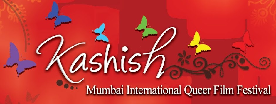
Manoj Khiyani who designed the logo has some interesting thoughts to share about the logo's symbolism -
- Red - The color of Love, Passion & Excellence. The Brighter Warmer side of Gay/Lesbian/Trans. people.
- Why Butterfly - In its lifecycle, a butterfly goes through tremendous changes. It cucoons itself and finally comes-out with great struggle. Once out, it sees the brighter side of life with lovely shades of its wings. The same applies to many of us from the LGBT Community.
- Different butterflies with Rainbow shade - represent different people from LGBT community, just like no 2 fingers are alike.
- How does it relate to Kashish - Kashish means attraction. Butterflies are attracted to the flowers. The theme goes well with the name too. Gay men love everything thats beautiful. Flowers & Gardens are simply beauty divined.
- Why no LGBT Icons - circle arrows or M-F signs or rainbow flag. We are all one. Why show m2m, f2f or why divide between gay or lesbians etc. We have shown all 7 colors as different butterflies. To Each its own.
- How could this theme be okay of a LGBT event - Its bright, it's relevant, it speaks for itself. It doesn't have any potential to create problems from various anti-gay or religious groups.
- How does it relate to LGBT India - The theme shows gardens emerging, butterflies flying high.. happy n gay.. as the country slowly embraces LGBT Community with its acceptance & Understanding. The color of love - read adds warmth. The white text shows peaceful acceptance to the Kashish between same sex people.


